Olennita® is a creative hub founded on nearly ten years of training in Design and Advertising.
A proprietary methodology, a unique perspective, and brands prepared to stand the test of time.
A Visual Identity begins with understanding who the brand is, where it wants to go, and what it needs to communicate.
From the strategic briefing to the final delivery, every decision moves through the five stages of the Olennita® Framework, ensuring that the Visual Identity works clearly in any context and grows alongside the business.
Stationery, email signature, social media, and professional mockups developed according to the segment. The Identity operating across every touchpoint with the same strength and consistency.
Purpose, Mission, Vision, Tone of Voice, and Visual Direction. Everything that guides the way the brand presents itself, communicates, and positions itself. The strategic foundation that supports every creative decision in the project.
A complete document that organizes and explains every decision in the project. Typography, colors, symbol, applications, and usage guidelines. A manual that anyone can open, understand, and follow.
Designer and Advertiser graduated from Univale. Nearly ten years building Visual Identities that carry history, intention, and direction.
Olennita® was born in 2019 from a choice: to build something that was entirely my own. What began as a creative space became a studio with methodology, process, and a very specific perspective on what a brand needs to be.
The dual background in Advertising and Design defines this perspective. I see beauty and strategy at the same time, and it is this combination that makes every delivery unique. Brands are treated here with everything they are worth. They are real stories, told through design.

A methodology developed to organize brand building as a system. Five sequential stages, each with a specific role within the process. Intention defines the starting point. Direction organizes how that intention will be perceived. The system structures how the brand operates across different contexts. Presence determines how it behaves at every touchpoint. Legacy ensures that all of this remains sustainable over time.
Each segment brings a different perspective. It is this diversity
of projects and stories that shapes our repertoire.
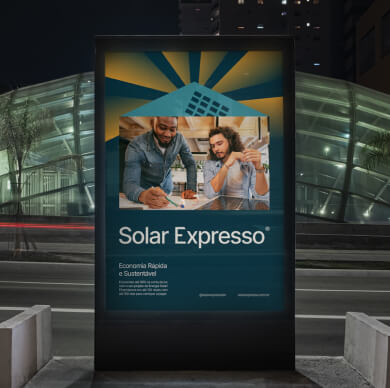
Speed and sustainability in the form of a brand. A sun in motion that communicates agility, trust, and the commitment to deliver solar energy in an accessible and efficient way.
An identity built for a company that takes care of people with seriousness. Presence, structure, and credibility from the very first contact. A project that supports growth, differentiation, and recognition.
Life reorganizes itself in flow. The identity translates this logic into form, color, and movement. A butterfly built from the letter M, in an upward trajectory, carrying continuity and direction in every variation.
Everything you need to know is here. How we work, what we deliver, and how your brand takes shape.